|
||||
 |
FILE 92/143 |  |
 |
 |
 |
|
||
|
|
||||||||
| File information | |
| Filename: | Llyn-Padarn-web.jpg |
| Album name: | vxisme / My stuff |
| Filesize: | 190 KiB |
| Date added: | Sep 22, 2008 |
| Dimensions: | 822 x 1000 pixels |
| Displayed: | 108 times |
| URL: | https://cameracraniums.com/gallery/displayimage.php?pid=771 |
| Favorites: | Add to Favorites |
| BBCode normal size: | |
| BBCode full size: | |
Comment 1 to 7 of 7 Page: 1 |
|
|||
|
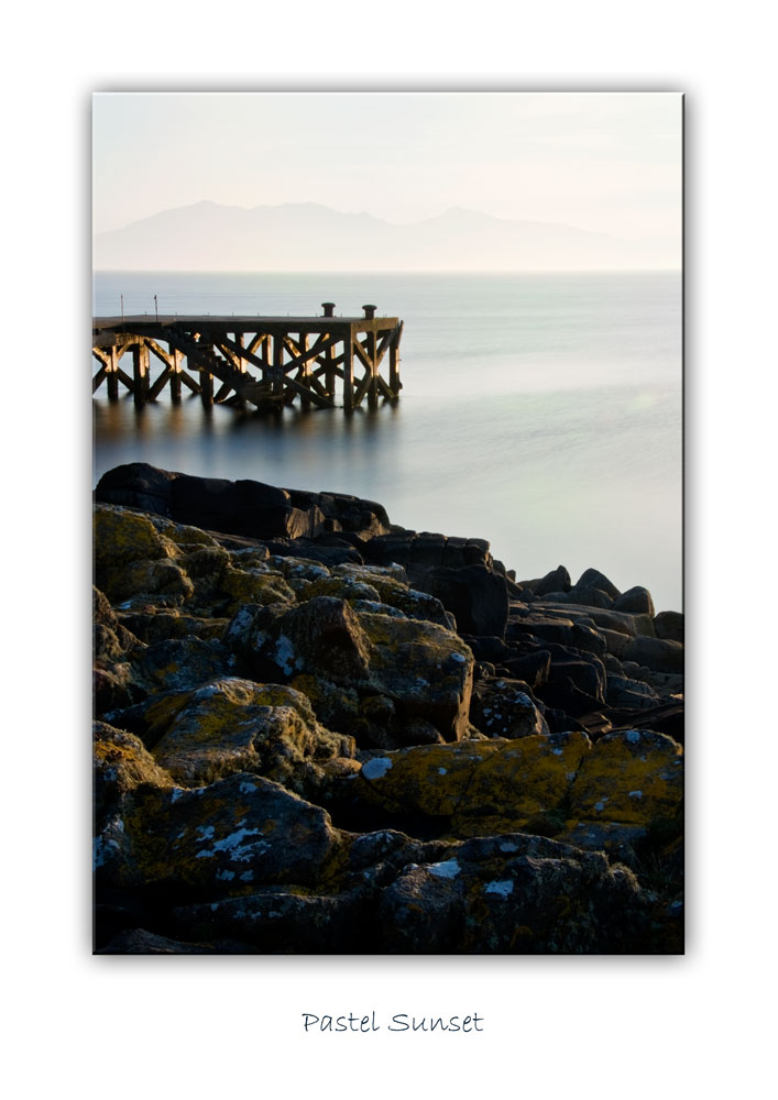
Donny, this composition is right on for me. However, overall I find the image looks a bit too processed for my taste. It's that lovely British light taken a bit too far I think. Mind you, it does bring out super texture but I can't quite buy it. The white in the sky is too hot and I find it distracting. Actually, as look more I wonder if there might not be too much sky? It's a tad unbalanced do you think? I'd take a tuck and leave just enough white to give a light source for the coattage.
|
|
|||
|
I can see what you are saying re: the sky, but it does add a bit of drama for me. Like the bright sun bursting through storm clouds.

|
|
|||
|
I should have mentioned its HDR hence the wee touch stronger processing,
|
|
|||
|
Donny, I did realise that, but even with hdr my feelling is it's one notch too much. But I should have mentioned I'm not a big fan of hdr

|
|
|||
|
After some thought on this one, ive had another go at it, but do agree there is room for improvement.
|
|
|||
|
I am not a fan of HDR either. My first reaction was as well there was something wrong. I think and this is purely my opinion that a landscape picture should have a rectangular format. It does not often work in square format. I do like the composition in the picture, with the bridge and the water oth leading to the white building, further enhance by the bright sky. I just wonder if some more water at the front would give this a more rectangular look and make it feel less compacted. I commented because I do like the the pic and for HDR it is really rather nice. Showing that HRD can work if not exaggerated.

|
|
|||
|
Agree about landscape..this is not a landscape though, the idea behind this view is to lead the viewers eye in from the clear water front left and up to the bridge and along it and then finish with the sky and cottage. hence the reason for the tighter crop to hold ones attention on those focal points of the image. before i wiped my gallery last week there was a full landscape of the same bridge giving it the full monty as you pointed out, ta much for the words S, appreciated.
|
Comment 1 to 7 of 7 Page: 1 |


