Poll
I took mine in the two hour gap when it stopped raining or being thickly fogbound that week :tup:
I did one featuring our Leeds dalek ( Bridgewater Place structure complete with neon lights around the top that is so well designed that they have to close the roads around it on a windy day after a tragic death when a lorry blew over onto a poor guy a few years back). In bright light and blue skies it just didn`t appeal to me though so went for the deconstructed effort. You should have put one in Abers.
Middle of chuffing nowhere it seems sometimes!
Question: Please vote for your favourite 'Scape
Option 1: Deconstructed Landscape

votes: 2
votes: 2
Option 2: Yosemite Reflections

votes: 5
votes: 5
Option 3: The Field

votes: 2
votes: 2
Option 4: Seascape to Wales

votes: 4
votes: 4
Option 5: Run Of The Mill

votes: 0
votes: 0
Option 6: La Geria Vineyards, Lanzarote

votes: 0
votes: 0
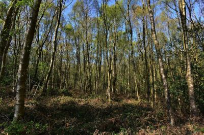
Option 7: Woodscape
votes: 0
votes: 0
Title: Poll - 'SCAPE-Weekly Comp 19-26 April
Post by: DigiDiva on April 28, 2015, 05:56:10 PM
Post by: DigiDiva on April 28, 2015, 05:56:10 PM
Please vote for your favourite 'Scape
Title: Re: Poll - 'SCAPE-Weekly Comp 19-26 April
Post by: Hinfrance on April 30, 2015, 07:56:16 PM
Post by: Hinfrance on April 30, 2015, 07:56:16 PM
BUMP
Title: Re: Poll - 'SCAPE-Weekly Comp 19-26 April
Post by: DigiDiva on May 01, 2015, 11:38:55 PM
Post by: DigiDiva on May 01, 2015, 11:38:55 PM
Bump
Title: Re: Poll - 'SCAPE-Weekly Comp 19-26 April
Post by: jinky on May 02, 2015, 08:05:23 PM
Post by: jinky on May 02, 2015, 08:05:23 PM
Well done Spikeyjen - lovely shot
Title: Re: Poll - 'SCAPE-Weekly Comp 19-26 April
Post by: Hinfrance on May 02, 2015, 08:19:08 PM
Post by: Hinfrance on May 02, 2015, 08:19:08 PM
Congrats Jen!
Title: Re: Poll - 'SCAPE-Weekly Comp 19-26 April
Post by: Oldboy on May 02, 2015, 09:04:51 PM
Post by: Oldboy on May 02, 2015, 09:04:51 PM
Well done spikeyjen. :tup:
Title: Re: Poll - 'SCAPE-Weekly Comp 19-26 April
Post by: spikeyjen on May 02, 2015, 10:00:06 PM
Post by: spikeyjen on May 02, 2015, 10:00:06 PM
Thanks everyone, I'll put up the next topic soon.
My vote went for Seascape to Wales, great tree, nice sky, but I thought a little crop off the left might help a little and I can't work out if the horizon is crooked but I think it is.
I almost went for Deconstructed Landscape - great idea and would make a good topic in the future.
The Field is very pretty, and almost ethereal, nice soft colors and loved the picture, but wasn't sure that it met the criteria (my opinion)
Run of the Mill has a very crooked horizon, and I noticed that very quickly
Le Geria Vineyard was interesting, but I would have placed the house more to the left
Woodscapes, I like these images but you really need something punchy to take it off. I would have straightened the trees (yes I can see it was taken with a wide angle), and then put something of interest (color, log, moss, rocks) in the foreground that helped you move into the trees. I also found it a little dark in the foreground but that could just be my screen.
Title: Re: Poll - 'SCAPE-Weekly Comp 19-26 April
Post by: kerbside on May 02, 2015, 10:25:21 PM
Post by: kerbside on May 02, 2015, 10:25:21 PM
Yep the horizon is not horizontal Jen but in my defence it was a very quick process and something that I missed. Anyway thanks for the vote.
Title: Re: Poll - 'SCAPE-Weekly Comp 19-26 April
Post by: Reinardina on May 03, 2015, 08:35:58 AM
Post by: Reinardina on May 03, 2015, 08:35:58 AM
Congratulations Jen. A beautiful impression of an impressive landscape.
Title: Re: Poll - 'SCAPE-Weekly Comp 19-26 April
Post by: Hinfrance on May 03, 2015, 04:47:01 PM
Post by: Hinfrance on May 03, 2015, 04:47:01 PM
Ooops, forgot to add my one liner pennyworth on the entries.
So here goes:
Deconstructed Landscape: this one got my vote as I could see it on a wall somewhere. I liked that it was a bit different.
Yosemite Reflections: A classic calm and beautiful scene, but I don't think the 4:3 format suits it and the tree on the top right hand side draws my eye relentlessly. For me, not something for the wall.
The Field: pretty much perfect really :D
Seascape to Wales: the crop works, the colours are appealing, the trees are dramatic. OK, so wobbly horizon, but my runner up choice.
Run of the Mill: The colours are a bit too vivid for my taste and there really isn't much of interest in the frame.
La Geria Vineyards, Lanzarote: I know it's what you had to work with DD, but ash is just so, well, grim . .
Woodscape: Just a little too flat and rather busy. Were you still looking for that cuckoo Oldboy?
Title: Re: Poll - 'SCAPE-Weekly Comp 19-26 April
Post by: jinky on May 03, 2015, 07:02:32 PM
Post by: jinky on May 03, 2015, 07:02:32 PM
A few pennorth from me.
1. Mine. I saw a Facebook post by WEX (Warehouse Express as was) that posted a fairly uninteresting example of multiple shots . Didn`t like that but liked the idea so gave it a go on a walk up the Chevin in Ilkley ignoring the run of the mill Cow and Calf Rocks with a deep blue cloudless sky - maybe I shouldn't have resisted that one. Anyway thanks for the votes H and AN Other
2 Yosemite. My runner up which might have won but for the thought that I was missing some of the view left and right with the crop and like H was drawn to the shrubbery at each side. I wanted a greater expanse but maybe your position excluded that possibility.
3. The Field - got my vote as it gave me that space. I`d have liked it aimed slightly more left to lose that shrubbery on the right and isolate the tree and maybe more detail down to the ground I foreground but pleasing enough to win me over.
4. Wales - a bit overcooked HDR in the sky detail for me and needed a crop left I think. Liked the shape of the trees and thirds making up the image though.
5.Run of the Mill - was a little flat and vivid (can it be?) with no interest point for me either I am afraid
6. Lanzarote Vineyards - was so looking forward to seeing this image as I`d messaged you saying to look out for them. I think the placement of the building dead centre and the lines taking you out of the frame just left it cluttered. Needs a little contrast punch to show that black ash spoil I feel.
7. Woodscape - nice enough woodland scene but did not stand out as much as the trunks of the trees nearest on left and did not give me the thought of wanting to be there.
I must admit I don`t think any of this weeks images wowed me as much as I thought they might. Yosemite had the visual impact but the biggest thing missing from all the entries was that magical light that a great landscape needs to really shine through. I guess none of us were able to get out in it. I missed a few great sunset opportunities sat on my backside looking at it through the back window. I only got one nice bit of light in my range of shots on the leaf in shade and light shots on my collection as I ended up out there just after midday which might have made that Cow and Calf shot just a picture postcard bore. I guess it`s one of the challenges of a time limited competition when chasing a great landscape.
Title: Re: Poll - 'SCAPE-Weekly Comp 19-26 April
Post by: Hinfrance on May 03, 2015, 07:12:20 PM
Post by: Hinfrance on May 03, 2015, 07:12:20 PM
Quote from: jinky on May 03, 2015, 07:02:32 PM
I must admit I don`t think any of this weeks images wowed me as much as I thought they might. Yosemite had the visual impact but the biggest thing missing from all the entries was that magical light that a great landscape needs to really shine through. I guess none of us were able to get out in it.
I took mine in the two hour gap when it stopped raining or being thickly fogbound that week :tup:
Title: Re: Poll - 'SCAPE-Weekly Comp 19-26 April
Post by: spikeyjen on May 03, 2015, 10:02:57 PM
Post by: spikeyjen on May 03, 2015, 10:02:57 PM
thanks for the feedback guys, and yes Jinky, you are right about that missing element called LIGHT
Title: Re: Poll - 'SCAPE-Weekly Comp 19-26 April
Post by: ABERS on May 03, 2015, 10:32:41 PM
Post by: ABERS on May 03, 2015, 10:32:41 PM
Nobody entered an urban or city scape, everybody's mind set on the wide open spaces.
Title: Re: Poll - 'SCAPE-Weekly Comp 19-26 April
Post by: Hinfrance on May 04, 2015, 05:56:06 AM
Post by: Hinfrance on May 04, 2015, 05:56:06 AM
Oh, I thought about a cityscape. My nearest city is a two hour drive away, the nearest sea three hours, but the nearest field is less than 100 metres. Which picture woud you have tried to get?
Title: Re: Poll - 'SCAPE-Weekly Comp 19-26 April
Post by: jinky on May 04, 2015, 06:41:39 AM
Post by: jinky on May 04, 2015, 06:41:39 AM
Quote from: ABERS on May 03, 2015, 10:32:41 PM
Nobody entered an urban or city scape, everybody's mind set on the wide open spaces.
I did one featuring our Leeds dalek ( Bridgewater Place structure complete with neon lights around the top that is so well designed that they have to close the roads around it on a windy day after a tragic death when a lorry blew over onto a poor guy a few years back). In bright light and blue skies it just didn`t appeal to me though so went for the deconstructed effort. You should have put one in Abers.
Title: Re: Poll - 'SCAPE-Weekly Comp 19-26 April
Post by: ABERS on May 04, 2015, 08:11:40 AM
Post by: ABERS on May 04, 2015, 08:11:40 AM
It just crossed my mind that landscape immediately conjures up wide open vistas in the mind. I'm no different, and if you're out in the countryside why not?
Title: Re: Poll - 'SCAPE-Weekly Comp 19-26 April
Post by: Hinfrance on May 04, 2015, 09:54:27 AM
Post by: Hinfrance on May 04, 2015, 09:54:27 AM
Quote from: ABERS on May 04, 2015, 08:11:40 AM
It just crossed my mind that landscape immediately conjures up wide open vistas in the mind. I'm no different, and if you're out in the countryside why not?
Middle of chuffing nowhere it seems sometimes!
Title: Re: Poll - 'SCAPE-Weekly Comp 19-26 April
Post by: DigiDiva on May 04, 2015, 05:39:07 PM
Post by: DigiDiva on May 04, 2015, 05:39:07 PM
Quote from: jinky on May 03, 2015, 07:02:32 PM
A few pennorth from me.
6. Lanzarote Vineyards - was so looking forward to seeing this image as I`d messaged you saying to look out for them. I think the placement of the building dead centre and the lines taking you out of the frame just left it cluttered. Needs a little contrast punch to show that black ash spoil I feel.
I had so many to choose from and I obviously chose badly. This was my hubby's choice and I regretted it almost immediately. I had lots o colourful images including the salt flats, mirador del rio and laguna verde. He ho, will pick myself next time.
Here's my comments:
Deconstructed Landscape. I nice 'outside the box' image but not really what I had in mind when setting the theme however I did like it.
Yosemite Reflections. A deserved winner, spot on and just what I had hoped to see. Well done.
The Field. Got my vote. Loved the retro feel to this one and the composition.
Seascape To Wales - The bend in the trees really gave this image character. This was my 2nd favourite image.
Run Of The Mill. Was a little too run of the mill for me. Sorry.
Woodscape. I think this could have benefitted from different lighting, maybe catching some rays through the trees at sunup/sundown. Would have given it a more haunting feel.
Title: Re: Poll - 'SCAPE-Weekly Comp 19-26 April
Post by: jinky on May 05, 2015, 07:05:09 PM
Post by: jinky on May 05, 2015, 07:05:09 PM
This is the Facebook piece I saw that made me think about doing a deconstructed landscape. I thought his were rather excessive in number and lacking emphasis so chose to do a smaller range / format
http://www.wexphotographic.com/blog/deconstruction-a-simple-trick-for-different-landscapes?cm_mmc=Facebook-_-Wexfacebook-_-blog-_-deconstruction-a-simple-trick-for-different-landscapes&utm_source=Facebook&utm_medium=blog&utm_campaign=deconstruction-a-simple-trick-for-different-landscapes
http://www.wexphotographic.com/blog/deconstruction-a-simple-trick-for-different-landscapes?cm_mmc=Facebook-_-Wexfacebook-_-blog-_-deconstruction-a-simple-trick-for-different-landscapes&utm_source=Facebook&utm_medium=blog&utm_campaign=deconstruction-a-simple-trick-for-different-landscapes
Title: Re: Poll - 'SCAPE-Weekly Comp 19-26 April
Post by: Reinardina on May 06, 2015, 07:07:19 AM
Post by: Reinardina on May 06, 2015, 07:07:19 AM
I had seen something about it in the past, possibly in the DCM days. I remember I had a go at it and never got anywhere.
By the way, I am 'AN Other' and voted for this deconstructed landscape.
Congratulations on the win Jen, a classic landscape. And yet again, I did not see the tree, till someone pointed it out. I'm not sure I'll ever learn to 'see' a photograph in its entirety. I often blank out things that shouldn't be there, and only see what I am meant to see.
I took a city scape while on my way to Elsewhere, but never got round to entering it. In a way it is the opposite of Jinky's deconstructed landscape: A construction City Scape.
This is it:
(http://cameracraniums.com/gallery/albums/userpics/11140/normal_City_scape_str_cr_lucky_res.jpg) (http://cameracraniums.com/gallery/displayimage.php?pid=17480&fullsize=1)
Now that I see it on the page, I realise it is still a bit wonky. Of course I did not see that on my screen!
Title: Re: Poll - 'SCAPE-Weekly Comp 19-26 April
Post by: jinky on May 06, 2015, 07:56:50 AM
Post by: jinky on May 06, 2015, 07:56:50 AM
And thanks to you then Reinardina. Don`t think yours is shot wonky - just distorted perspective because of focal length I think. Nice to try something different
Title: Re: Poll - 'SCAPE-Weekly Comp 19-26 April
Post by: Reinardina on May 06, 2015, 08:35:20 AM
Post by: Reinardina on May 06, 2015, 08:35:20 AM
The left hand side is not quite straight. I should have cropped a bit off that side to hide it.