• Welcome to Camera Craniums: The Photography Community for Enthusiasts.
 
Members
Stats
  • Total Posts: 62,412
  • Total Topics: 5,705
  • Online today: 158
  • Online ever: 856 (January 21, 2020, 09:07:00 AM)
Users Online
  • Users: 0
  • Guests: 79
  • Total: 79
  • Baidu
If you would like to make a donation to help with the running costs of the site, then a donation button has been added to the bottom of the page.  Thanks.
Temu £100 Coupon bundle o...Amazon Spring Deal: SanDi...🌸🌼 Get Ready to Blossom w...Marantz Professional MPM-...Google Pixel 7a and Pixel...JasmineSanDisk Ultra 64GB USB Fl...SanDisk 512GB Extreme PRO...GiaDo You Shoot Photos With ...Which eye do you use with...SanDisk 256GB Extreme PRO...Duracell Plus Alkaline 1....RØDE VideoMicro Compact O...I must be one of the rare...Learning Resources

POLL for FRAME A PICTURE

Started by jimthetrain, September 29, 2009, 11:57:27 AM

Previous topic - Next topic

Vote now

Tringle WP - Castillonnes window view
 
5 (23.8%)
oRGie - Behind you
 
3 (14.3%)
Jimthetrain - Up the garden path
 
1 (4.8%)
Oldboy - Red Brick
 
1 (4.8%)
jinky - Framed tree
 
2 (9.5%)
Sandy - Framed reflection
 
2 (9.5%)
greypoint - Hurry up mum
 
0 (0%)
Sarasocke - Framed pumpkins
 
0 (0%)
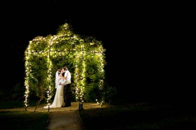
Jonathon - Framed B&G
 
3 (14.3%)
skellum(Dave) - I've been framed
 
2 (9.5%)
irv_b - The Fallen
 
2 (9.5%)

Total Members Voted: 21

Voting closed: October 04, 2009, 12:47:27 AM

jimthetrain

Poll is open. Well done to those who contributed. :tup:
BOOZE!!! Helping ugly people have sex.

Oldboy

Great selection of shots this week and not easy to choose just one. I've voted for Tringle WP's Castillonnes window view as the frame has character like an old master picture and it's a great view to boot.  ;D

Well done all.  ;D

jimthetrain

OOOPS!!! :doh:  I don't think I set the time limit on the poll and now it doesn't give me the option to set it. If someone could be so kind  :-* :-*
BOOZE!!! Helping ugly people have sex.

skellum

Quote from: jimthetrain on September 30, 2009, 11:25:12 AM
OOOPS!!! :doh:  I don't think I set the time limit on the poll and now it doesn't give me the option to set it. If someone could be so kind  :-* :-*

Set to end 11.30 saturday........ :legit:

jimthetrain

BOOZE!!! Helping ugly people have sex.

alan1572

i voted for jinky, very nice shot
Who wanted dry roasted with their pint?

jinky

Thanks Alan - mine went to Jonathan as I seem to be at / doing loads of wedding shots recently and liked the set up here. Lots of could have beens though !

Oldboy

Quote from: jinky on October 03, 2009, 02:00:36 PM
Thanks Alan - mine went to Jonathan as I seem to be at / doing loads of wedding shots recently and liked the set up here. Lots of could have beens though !


Not sure what you are saying there jinky!  :doh:

Well done to Tringle WP for the win this week. Lots of cracking shots which shows by the spread of votes.  :tup:

Thanks to the person who voted for mine.  :2funny:

oRGie


Jonathan

OK.....looks like I misunderstood the rules ;)  I thought the point of the comp was for critique - that's the only kind I enter.  So here are my unvarnished thoughts on the entries.  Hope nobody set the "can I critique" to no......

Tringle.  Pretty nice.  View's OK but your frame suffers a little from exposure latitude.  Brightest thing in the pic is the top of the frame and darkest is the bottom.  Personally I want the view to be the important thing and the frame is actually fighting with it here.  Some very (very) skillful flash could have set this pic alight.  Or you may consider some dodge and burn.  The tendril half way up on the left either needed tucking out of the way or cloning out.  Overall, nicely seen and pretty well shot.  But you could have done more with this.  [BTW: I voted for this one]

oRGie.  Hmmmmm.  Really cool idea and well executed.  Something's not right though because although I know you shot it for real it looks like you shopped it together and that counts against it.  Maybe more context for the pic?  Sorry not entirely sure why this doesn't work.

Jimthetrain.   Yeah.  A bit like Tringle's but not as good ;)  Nicely seen and reasonably well captured.  I want some light on the fence though so I can see what's going on.  Curvy bit at the top is way off symmetrical and this looks odd here.

Oldboy.  Well, more sort of orange brick than red.  Two major problems here.  1. the sliver of light on the right between the uprights.  Moving would have fixed this because it's bright and the wrong colour and therefore distracting.  2. It's boring.  Imagine a mysterious figure walking through it with maybe some smoke and definitely those lights lit.  You'd have walked away with it.  Or at least wait until the lights are lit.  Looks odd with them off.

Jinky.  Go see the comments on Jimthetrain's about the very dark frame.  Bit of evening light on the stone (real or make your own) and you'd be away.  But of course the view is pretty ordinary.  If it hadn't been for the frame would you have taken this?

Sandy.  Yeah looks like it should be on a chocolate box.  Colours are pretty dull and it lacks contrast (that's true of nearly all the pics here).  It's also not quite straight.  This would be my second place.

Greypoint.  Yeah it's fine....  Looks very familiar though.  I'm sure I saw an almost identical shot a while ago.  Needs cropping on the bottom left really.  I'd also like them both to be facing the same way (less story, more image)

Sarasocke.  Yeah it's alright I suppose.  I'm always harsher to shots like this because you have the chance to get them spot on and this really isn't.  We have hotspots on the pumpkins, grass running over the frame at the bottom and top, grass on the bottom left pumpkin, no real interest in the wood.  You could fix half of those in 5 secs before capture and the others in 5 mins in post.

Jonathan.  Wow.  Awesome.  I'm always amazed when I see your work. :)  Those 2 lights at the bottom right bug me now.  Shot about 12 hours into a 15 hour day and slightly more complicated to light than it looks.

Skellum.  Really nice idea.  Colours are flat and it looks underexposed.  Shot of the screens is nice - it's the "real you" that lets it down.  All I see is your elbow catching all the light.

Irv_b.  I left a comment on this already.  I said....Love the shadows. For me there are 2 problems (1) it's s-o-o-o close t symmetrical but not quite. So it bugs me. I'm not certain the sross is central or it's slightly twisted or something. (2) You've just lost the detail on the graves due to the sun. I just want a fraction more shadow there to give the image something to bite on. You should be able to edit this back in with curves.   This one is either 3rd or second for me (I'd demote Sandy depending on my mood)
It's Guest's round

oRGie

#10
Quote from: Jonathan on October 04, 2009, 06:45:10 PM
OK.....looks like I misunderstood the rules ;)  I thought the point of the comp was for critique - that's the only kind I enter.  So here are my unvarnished thoughts on the entries.  Hope nobody set the "can I critique" to no......

oRGie.  Hmmmmm.  Really cool idea and well executed.  Something's not right though because although I know you shot it for real it looks like you shopped it together and that counts against it.  Maybe more context for the pic?  Sorry not entirely sure why this doesn't work.


Not at all Jonathon, your crit is most welcome :)   and yes the point of the comp is to progress our skills, so critique is very good to have, but its not easy for everyone for various reasons, so its not mandatory ;)

Once again your very perceptive, your right the shots are genuine, ps only to tidy out a walker that happened to be passing as the bikes reached the place I wanted them and a bit of crop and straighten, touch of warming filter. I also thought that it looked like a ps job and lacks something, perhaps a clearer view of the lead riders face, eye contact or something would have helped. Here's the original jpg straight out of camera, just resized.


Thanks for taking time to do the crit, I'm sure everyone welcomes it  :beer:

Hinfrance

Thanks for taking the time to write some crits Jonathan.

As for mine, can't argue there. In my defense (OK my excuses are): I only had the on camera flash available to me and I did try to get some fill light with that, but even a -2 stops the shadows from the undergrowth were just too harsh - the plants were actually a good few inches away from the wall and shadows were not avoidable.

It's actually a composite, because I wanted the frame lighter - though I see where you are coming from - the view through the window is from another frame bracketed at the same time. Unfortunately it was a bit hazy, so you get what you get . .  ;)

Time for a  :beer:

Howard  My CC Gallery
My Flickr
The theory seems to be that as long as a man is a failure he is one of God's children, but that as soon as he succeeds he is taken over by the Devil. H.L Mencken.

irv_b

#12
Yeah thanks for taking the time to write a critique it was fully appreciated and the points noted ;)
Congrats H on winning although jonathon got my vote yours was worthy of the win :tup:
My Gallery

Don't count the days "Guest," make the days count!.

bones615

Good job Jonathan, its nice to see other peoples views & why one entry may get more votes than others.

jinky

Yeah nice job on critique Jonathan and of course you are right on  mine. I was out doing some other shots with my camera and saw the frame. Puzzling why it`s so dark - not sure if anyone spotted it`s an HDR of three shots and I had trouble "lifting" it. Hand held and thus a bit shakey and I agree not an interesting subject in the frame - maybe should have done a composite and put the hanging gardens of babylon in there.

Cannot knock yours as I voted for it and was surprised it did not get a few more votes - great lighting even for 12 hours into the job! ;)

Camera Craniums is a participant in the Amazon EU Associates Program. This affiliate advertising program designed to provide a means for sites to earn advertising fees by advertising and linking to products on Amazon.